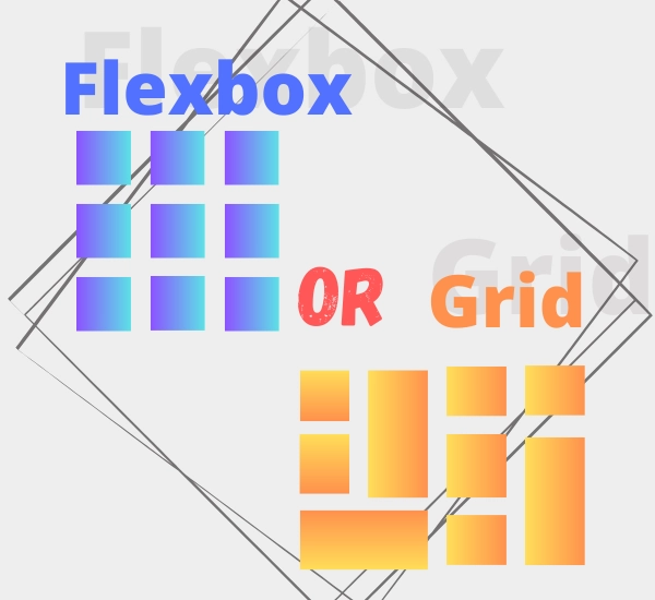
Difference between Flexbox and Grid
Introduction
When designing web pages, we often have to deal with layout arrangements. CSS provides us with various tools for this purpose, with the two most popular ones being Flexbox and Grid. Both technologies have their unique features and applications. In today’s article, we will examine the differences between them and discuss when it’s best to use Flexbox and when to opt for Grid. Let’s dive in!
Flexbox
Flexbox is a one-dimensional layout model that allows for flexible positioning of elements along the main axis (e.g., horizontally or vertically) and the cross axis.
Here are some advantages of Flexbox:
Advantages of Flexbox
- Flexibility: Flexbox is ideal for managing layouts that need to adapt to different screen sizes. It enables us to create responsive designs that look great on various devices.
- Ease of use: Flexbox offers an intuitive way to arrange elements. By using a few simple CSS properties, we can control the order, size, spacing between elements, and many other parameters.
- Axis choice: Flexbox allows for flexible positioning of elements along both the main and cross axes. This provides great freedom in designing and arranging elements in any desired manner.
Disadvantages of Flexbox
- Complex layouts: Flexbox is excellent for simple one-dimensional layouts but can be more challenging to handle when dealing with more complex two-dimensional layouts.
- Browser inconsistencies: Older browsers may not support all Flexbox features uniformly or may not support them at all. In such cases, additional CSS compatibility rules may be required or alternative solutions may need to be considered.
Grid
Grid is a two-dimensional layout model that allows you to position elements along both the main and transverse axes, so we can control both row and column. Grid offers powerful advanced features such as special control of individual elements, as well as the ability to specify where elements should be attached.
Here are some advantages of Grid:
Advantages of Grid
- Powerful layouts: Grid provides full control over element placement in both the vertical and horizontal directions. We can create more complex layouts with ease by dividing the space into columns and rows.
- Positioning: Grid allows precise control over the position and size of elements on a page. We can easily move, scale, and adjust them to fit our needs.
- Performance: Grid is designed with performance in mind. Optimizations in the CSS Grid implementation result in better rendering and overall performance compared to other element arrangement methods.
Disadvantages of Grid
- Complex layouts: Creating more complex layouts using Grid may require more knowledge and time. Understanding Grid rules and properties is necessary to fully utilize its capabilities.
- Incompatibility: Similar to Flexbox, Grid may not be supported in older browsers or may be supported inconsistently. In such cases, additional CSS rules or alternative solutions may be required.
Summary
Flexbox and Grid are powerful tools for managing web page layouts. The choice between them depends on the specific situation and project requirements. Flexbox is ideal for simple one-dimensional layouts and responsive designs, while Grid offers greater control and capabilities for creating more complex two-dimensional layouts. Remember that both technologies have their advantages and disadvantages, which should be considered when designing. Familiarity with both tools will allow you to flexibly adapt the layout to your needs and design goals.


